Public Awareness Poster Campaign
Description
In this project we designed a poster campaign raising public awareness about the importance of talking and reading to young children. This project is in collaboration with Emory University, Children’s Healthcare of Atlanta (CHOA), and Marcus Autism Center.
At the onset of the project, Dr. Jennifer Staple-Wax from the Emory and the Marcus Autism Center came to class and introduced us to their mission, their efforts and the need for a cohesive public awareness campaign to increase interactions between parents and infants and increase their language nutrition.
She showed us some previous work done on this campaign, the posters and videos which would be displayed. She explained the need for simple language keeping in mind the characteristics of the targeted audience. She also gave us a context about where these posters would be utilized.
She was very receptive towards the questions raised in class and addressed them. She then gave us background literature and a number of resources to help us with the concepts and designs.
Submersion
I immersed myself in the resources provided by Jennifer. I read the articles she had provided and made notes about points which I thought would be important. During this phase, I was concentrating on the facts, information and pointers that could be provided to parents.
I visited various websites related to this effort, specifically the ‘thirty million words’ initiative. I liked the way they used primary colors and the simplicity of their messages. They were to the point and concise. Their logo, which involved three interconnected speech bubbles was also inspiring.
Meanwhile, my classmates had also been looking at poster campaigns for inspiration and we all shared them on the class blog. It was interesting to look through the various poster campaigns and find the common design language, to analyze what worked and what didn’t, what made certain campaigns succeed and what could have been done differently.
I really liked the ‘Make your move’ set from Montana and it provided the best example for a cohesive and complete set. I also liked some of the posters from the AIGA ‘End gun violence’ campaign. They provided interesting visuals and a variety fascinating interpretations of the same content.
Ideation and Humiliation
I had to come up with 25-30 different ideas for the posters. I didn’t understand where to begin and what content to highlight. I decided to concentrate on the facts or directions for the parents. I thought of the various ways in which they could be laid out on paper. I somehow kept associating the message with objects from childhood such as a quilt, blanket, toys and picture books. I was thinking about who would be speaking the message in the poster, the voice of the poster and I thought about a baby, just speaking to the audience, telling them to talk to him.
I was also thinking about the joy of interaction and how the act of ‘talking to your child’ could b quality time spent and making memories for ever. I was also fascinated by the speech bubble and thought bubble and wanted to use them somehow in the poster. I also thought about how the information could be arranged on the poster in such a way that I could do away with the visuals and only focus on the content.
We showcased some of our best designs in class and the posters didn’t really look like posters. We had some good ideas though, so we split into groups based on ideas we wanted to work on. I teamed up with Florian to work on ‘the joy of interaction’.
Ideation again
Florian and I got together and thought about the different ways we could be joyful because of interaction. We also wanted to incorporate humor in the poster, because both of us felt that it is the best way to convey a serious message.
We thought about two scenarios of the parent interacting with the child. One of them was the voice of the parent telling the child things in everyday life and making it seem amusing or informational or emotional. The other was the voice of the child, where the child is thinking something in response to the parent, but it speaking out in babbles.
We also thought about how we could show the ‘good’ and the ‘bad’ side of using too much technology. Something along the lines of actually telling your child a story rather than using a storytelling app on the iPad.
Dealing with design tools
Once we had concepts ready, the difficult part was trying to put them on paper and making them seem visually appealing. That was a tough challenge. I faced problems translating what I wanted into what I could do. I also felt limited by my lack of expertise with the tools. I sketched what I wanted, the basic framework and the grid but doing the same digitally proved to be quite a hindrance.
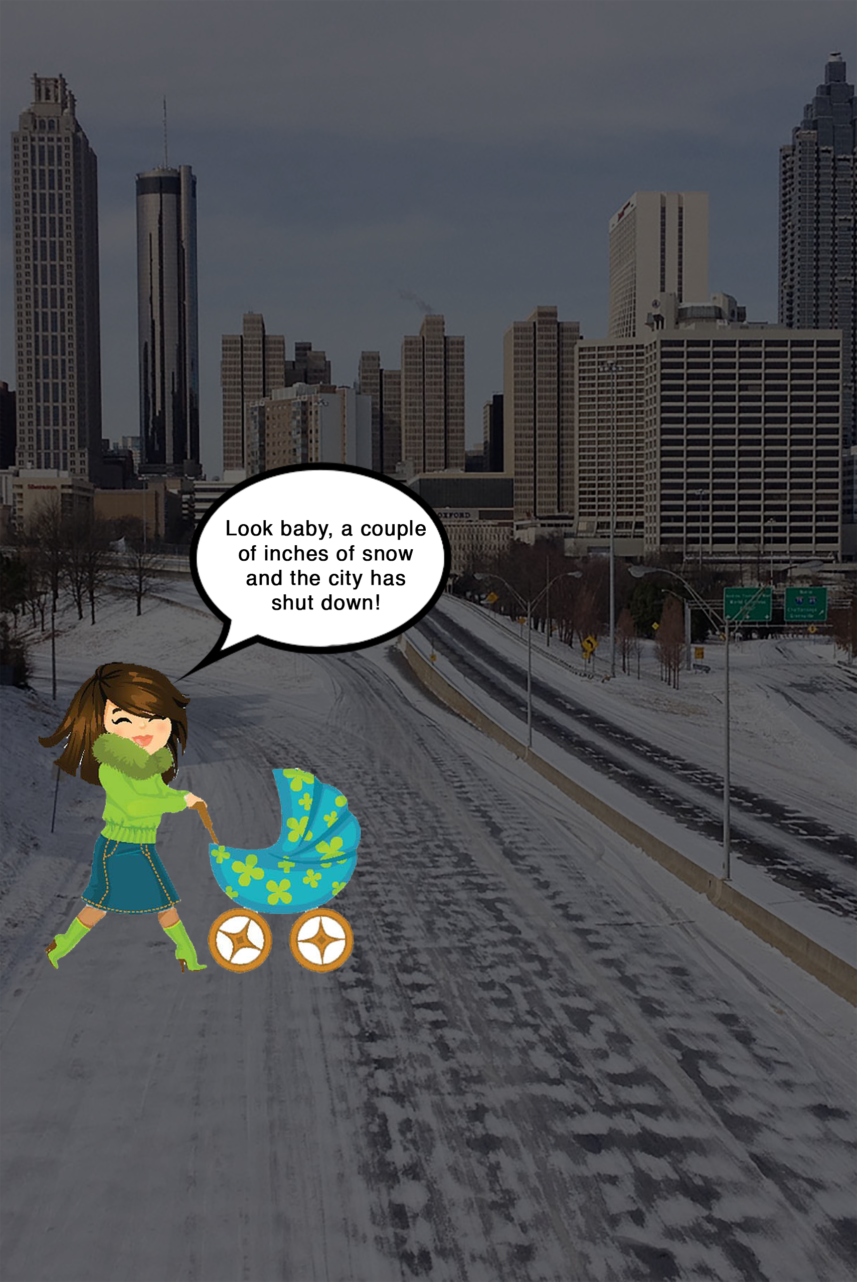
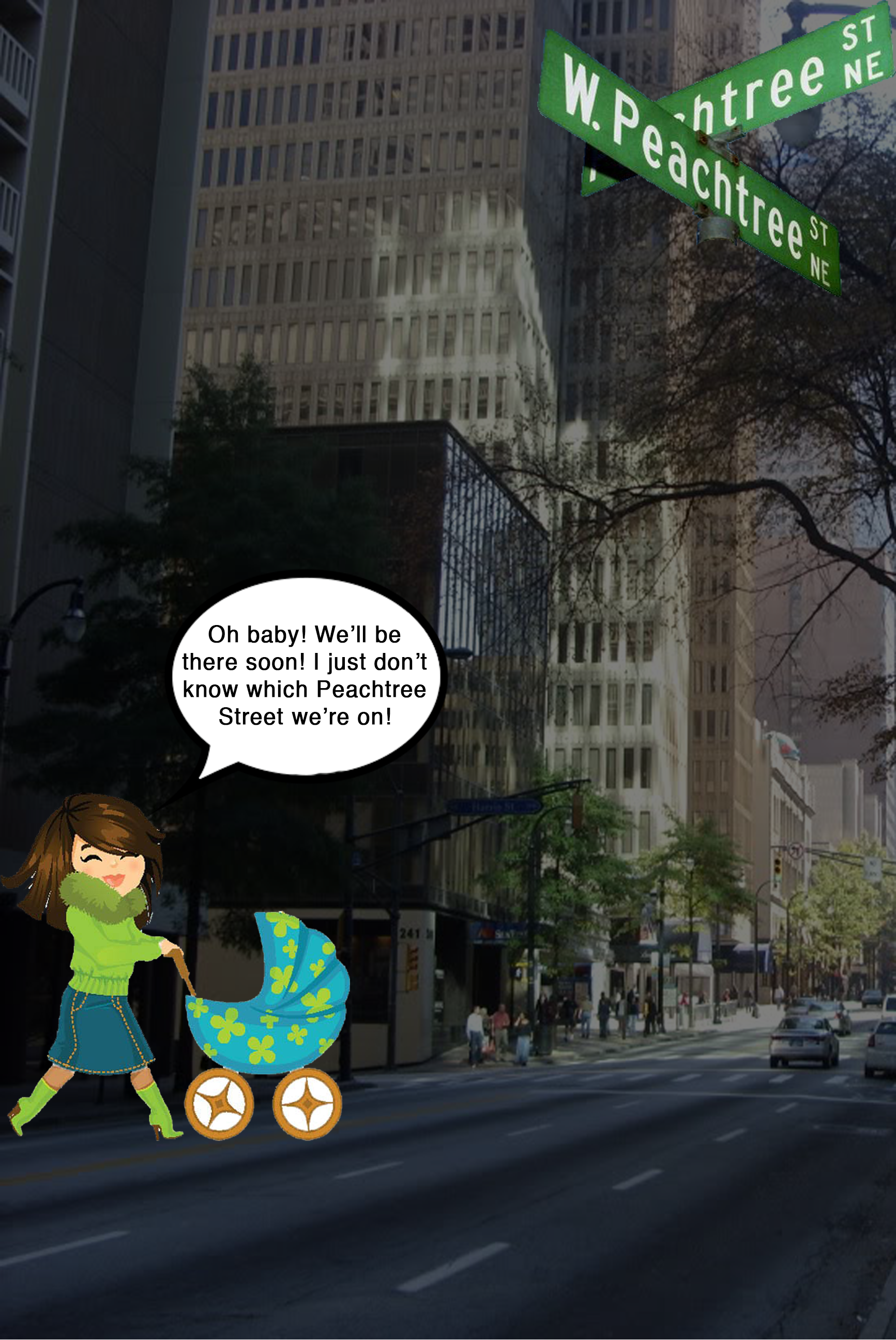
Since the concepts I was working on depended a lot on the pictures or photos of parents and children, finding such pictures was also difficult. I ended up using cartoon images for this stage, just so I could convey my idea effectively. The resulting images were childish and weird, but they contained all the content and basic building blocks I wanted.
During this phase, we also tried our hand at designing the footer for the posters. Florian and I were pretty clear about the text we wanted on the footer, so it simplified our job.
Critique
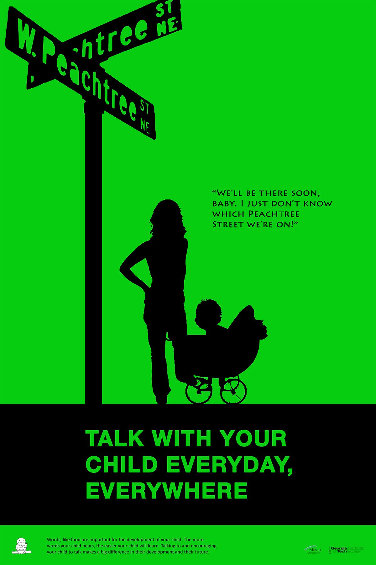
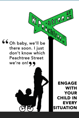
We had Jennifer and another colleague come back to critique the designs we had come up with. They loved the idea behind these posters of having the posters be Atlanta specific. They even liked the idea of giving pointers or examples to parents for them to talk to their children. The Peachtree sign was much appreciated and Nassim suggested having something symbolic in each poster. She even thought it could be a good series.
Refinement
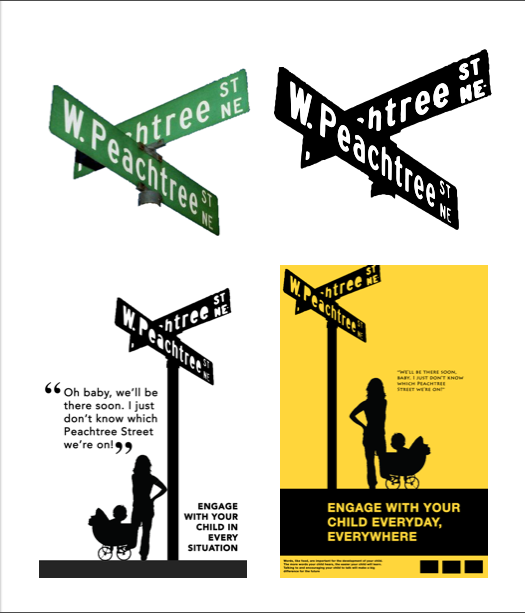
After the critique, I had a much clearer idea about what should be on the poster, what elements I wanted. I started with the poster with the Peachtree street sign, since I had the elements ready. I tried variations in the look of it, tried to make it colored, made it more cartoonish. I decided to do away with the cartoon characters and go ahead with the silhouettes since they gave me more freedom.
Silhouettes
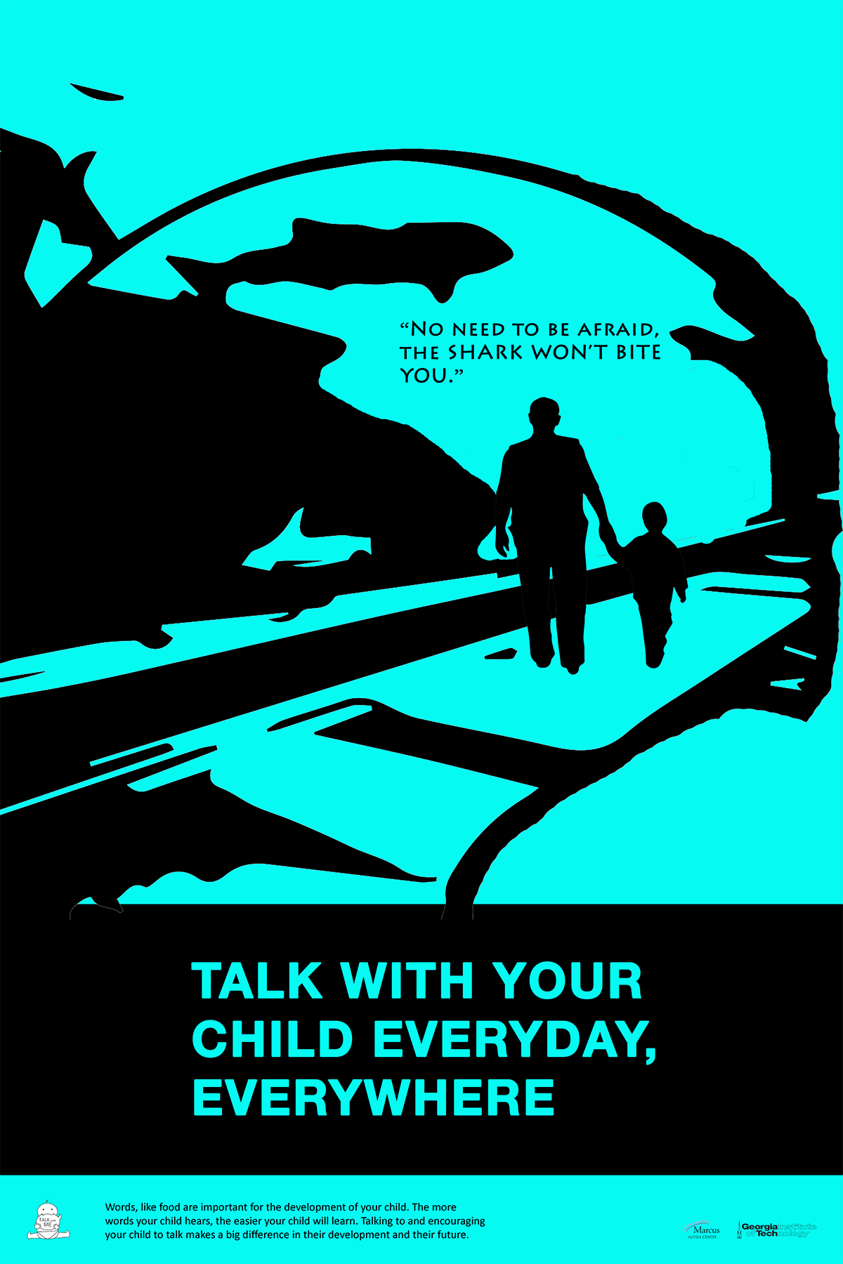
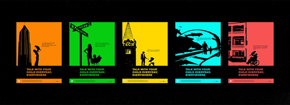
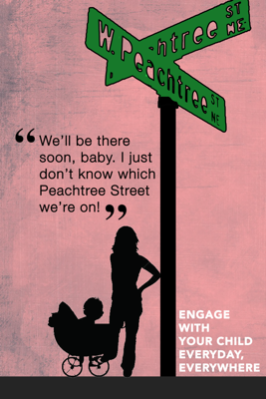
I didn’t like the use of colors for the elements and decided to try how they would look if they were all black. Once I did that, I worked on the placement, which message is more important and various fonts. Once I had that ready, I decided to use a bright color to catch the eye of the viewer. I incorporated the footer with the words we’d decided the previous iteration. Then I decided to use this poster as a template and come up with a series.The idea was to have an iconic structure or symbol and words related tho that symbol.
Iconic Structures
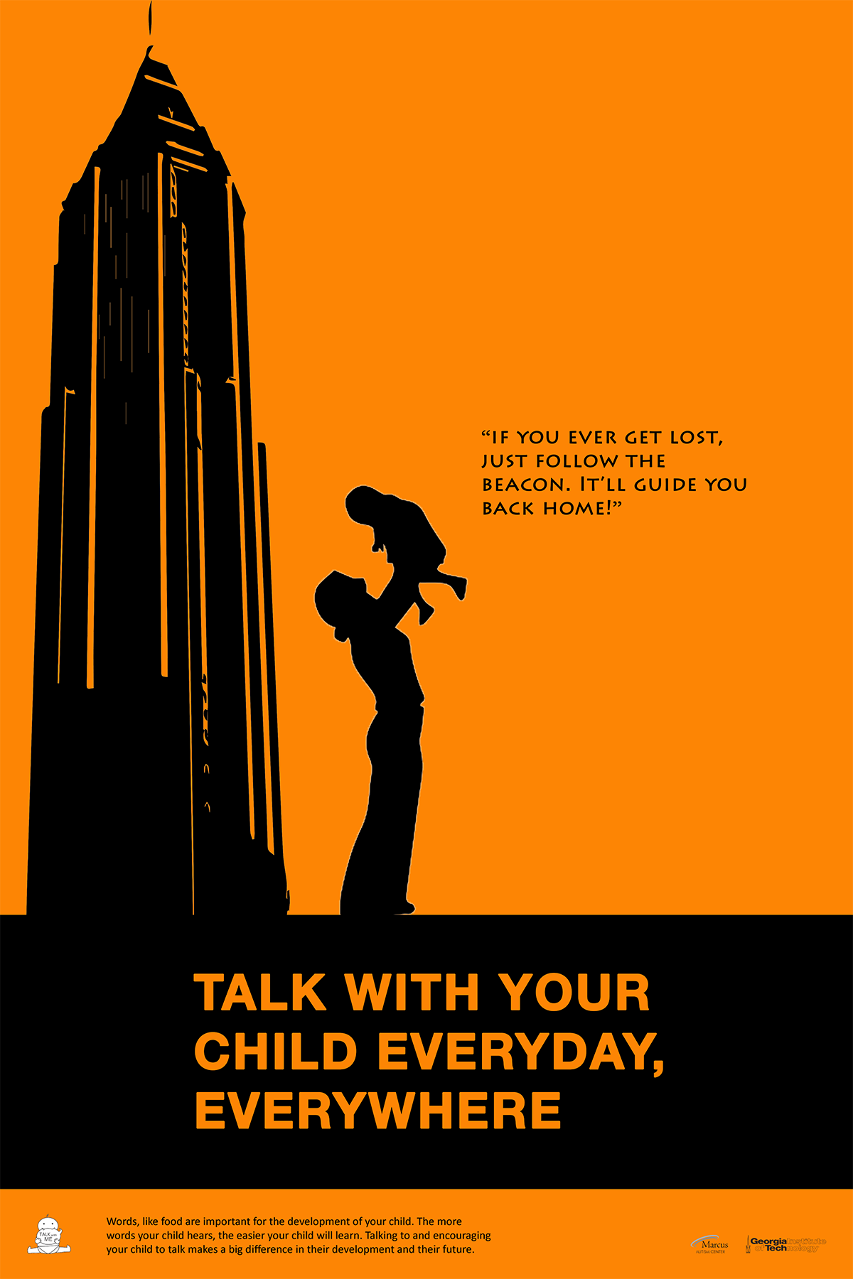
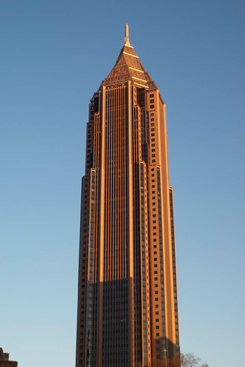
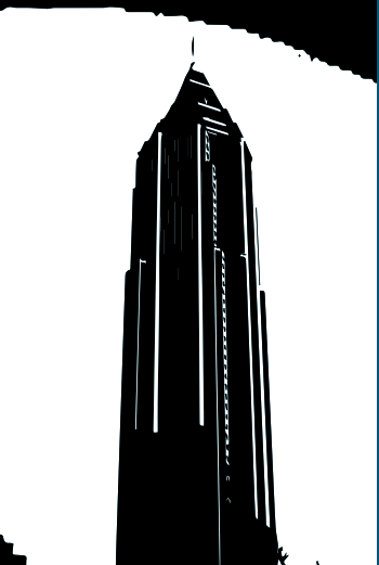
I was thinking about the structures which define Atlanta or symbols which define Atlanta. The first one that occured to me was the Bank of America building. I thought about how it is called 'the Beacon' and how we could use that to show therelationshio between a father and a baby. Then came the tough part of trolling the internet for a good picture of the building which could produce a good vectorized image.
Cumulation
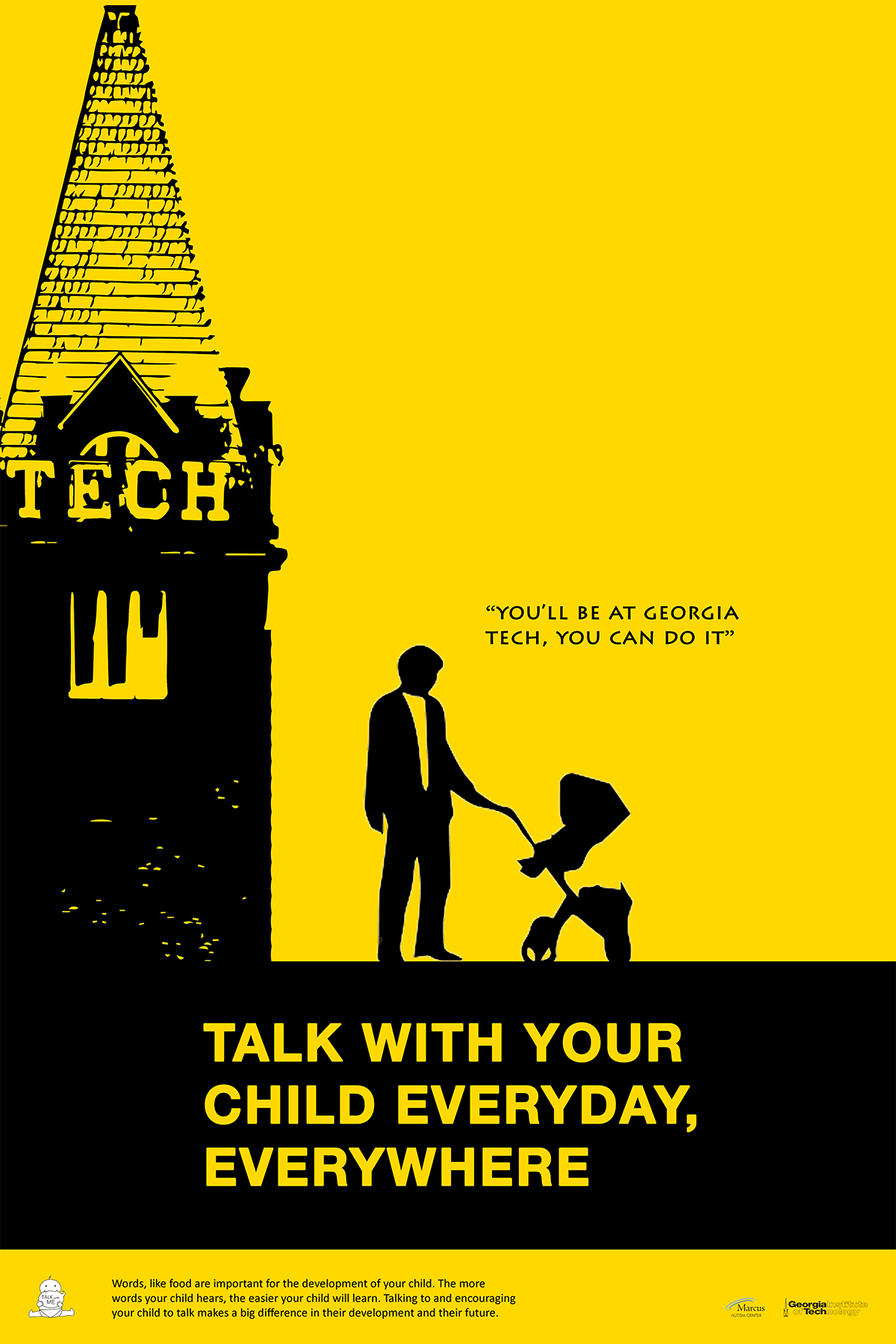
I thought Sports Teams would be a great way to involve more people to look at the posters. I came up with the icon for that but I could not think of any appropriate text, not being much of a sports person. Finally, I thought of Georgia Tech. I thought it could address the ‘aspirations and hopes’ that parents have for their children.
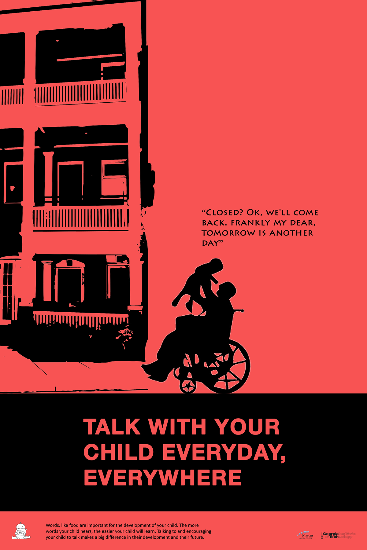
When we showed this set in class for critique, it was quite appreciated. I got some amazing feedback for refining it. Florian came up with more instances of structures. One was for the Margaret Mitchell House where we referenced some dialogues from the book itself. For the Georgia Aquarium, on Florian’s insistence, we decided to break the layout of keeping the structure on the left side of the poster and have it encompass the entire poster. We decided to use different people in the poster, like a grandfather in a wheelchair to bring about diversity. We replaced the word ‘engage’ with ‘talk’ for ease of comprehension.
Salvation
Once our set of five posters was ready, we had to print them, mount them and display them for all to see. Our set received generally positive reviews. Everyone appreciated the fact that they looked like a complete set, with each poster being different in itself. The bright colors were eye-catching and the lines were engaging.