To Do List on Glass
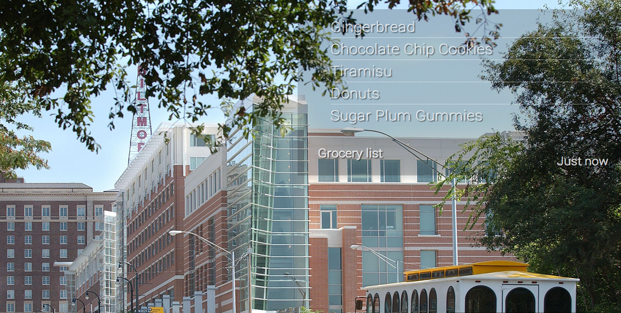
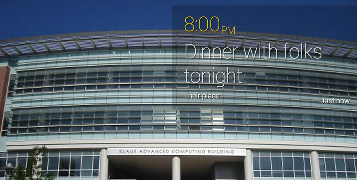
In this project for the 'Mobile and Ubiquitous Computing' course at Georgia Tech, we built an application which helps users manage their to-dos and notes using the Google Glass. The context-aware, ubiquitous and unobstrusive nature of the Google Glass was leveraged to make the task of managin to do lists as easy and transparent as possible.


Motivation
Short information scraps like todos, shopping lists, meeting reminders etc. are a very important part of people’s daily life. Currently people use a variety of ways to manage these information scraps like cellphones or sticky notes. However, applications using the ubiquitous nature of wearables have not really tacked this problem. We thought that the always-available nature of the Google Glass could be leveraged. We developed interactions to make the tasks of taking notes and referring to them as easy as possible.
The ubiquitous nature of this device is used to make information scraps to be more visible (displayed right in front of people’s eyes in an unobtrusive way), which is a poignant issue with all todo management methods. The recollection of todo items was more context-aware when created on a wearable device, notifications popped up based on a right context, making the todo items more visible and contextually appropriate. This served to reduce the load on the user's short-term memory.
Prototype and evaluation
We interviewed various users about their note-taking problem. We found what the various types of notes were and the different types of note-taking methods were. Based on this research, we decided to concentrate on quick notes and reminders, contextual information around these notes and the flow of this process. We also spent a lot of time looking at various applications on the Google Glass. We understood the design principles for these applications and their interaction patters.
Based on this study, we designed user-flow designs and created a web-based prototype. The web-based prototype was run on a laptop connected to a projector. The projectot displayed the content whoch would be present on the Google Glass screen. We used the 'Wizard of Oz' method to conduct our initial usability evaluations.
Final Application
From our evaluations, we found some inconsistencies in the flow of our system. We made modifications to both the flow and and the design. We then built the application to be used on a Google Glass.
We conducted user evaluations on this application by assigning users tasks such as creating a new todo, adding pictures and videos, checking a todo off, editing todos and reordering them based on their priority.
We found that more than 90% users successfully completed all the tasks assigned to them. Most of the problems that the users seem to have were due to the unfamiliarity with the Google Glass than with the application itself. Experienced Google Glass users were able to complete all tasks with ease.

